Font Pairings - what makes them work

How to make your branding pop with the best font pairings
Wine and cheese, Fred and Ginger, Ant and Dec*, they make good partners. Fonts work together too, the technical term is “font pairings”.
Typography is one of the first design choices you will make when starting a new project, whether it's website content, branding, or graphics. But picking a font fairing that is just right can feel akin to a dark art form.
Font choices convey a lot of meaning and feeling. Navigating the thin line between modern and vintage or cutesy and sweet can be tricky. This is the very reason why font pairing is so important.
For example, Lobster has a very different feel to Arimo, but when you pair them together - Lobster Arimo, the contrast creates harmony with the font pairing.

There are many good font pairings, and the best one for a particular project will depend on the desired look and feel, as well as the content of the project. Here are a few general tips for pairing fonts:
1. Choose fonts that have a similar level of formality.
2. Pair a sans-serif font with a serif font, or vice versa.
3. Use contrast to your advantage: pair a thin, light font with a bold, heavy font.
4. Consider the mood you want to create: use playful fonts for a fun, casual project, and use elegant fonts for a more formal project.
Experiment with different combinations and see what looks best. There are no hard and fast rules!
This article will discuss the ins and outs of font pairings and how to make the right pairing. Let's take a look!
What makes a good font pairing?
Font pairing is selecting two (or more) different fonts that create contrast in the most harmonising way possible. A good font pairing is not unlike a good relationship.
While opposites attract, the fonts must share common characteristics while retaining individuality. If you know how the different font families, such as serif, slab, sans serif, script, and handwritten, work together, you can combine them in the most meaningful ways.
Serif and sans serif font pairing
Serif and sans serif are the most well-known fonts - but what are they, and how are they different?
The difference between these two fonts is the small stroke on some fonts. Serif fonts have small strokes on the font, while sans serif fonts lack these strokes.
These two font families make more good font pairings. Serif fonts can convey more formal and classic moods, while sans-serif fonts are more modern.
But the meaning conveyed by font pairings is subjective because it depends on your chosen fonts.
Let's look at some examples of great serif and sans-serif pairings.
Oswald Heavy / Merriweather
League Spartan / Libre Baskerville
Playfair Display Black / Open Sans

What fonts are best for headlines
Picking out the right headline font will set the tone for the content that you put out, whether it's a magazine, blog, article, or web page. A good headline font will generate interest and make your content relevant to your readership and worth reading.
A headline font has to catch the reader's attention, conveying enough meaning to grab ahold of the viewer. Headline fonts are typically bold and stand out but look natural when paired with other fonts used in the body.
A few great examples are Merriweather, Raleway, Roboto Slab, and Poppins.

What makes a good body font?
Body fonts have a different purpose than headline fonts. The font needs to be clear and readable without too much personality. Otherwise, it can too easily distract from the reading experience of the article.
A simple and clear character with low contrast is the way to go.
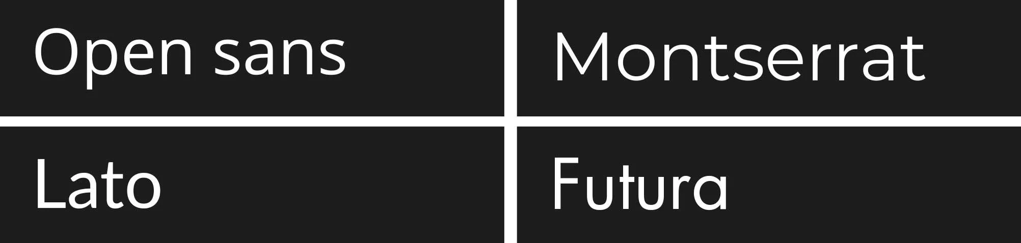
Great body fonts include Open sans, Montserrat, Lato, and Futura.
The best font combinations
Font pairings are no easy art to learn. Here are some of the best font combinations to get you started on creating an awesome reading experience in whatever you are writing/designing/creating.
Barlow Condensed and Montserrat
Playfair Display and Lato
Oswald and Source Serif Pro
April Fatface and Lato
Alegreya Sans Black and Alegreya
Aqua Grotesque & Roboto Slab Thin
Helvetica and Georgia
Futura and Garamond
Arial and Times New Roman
DIN and Noto Sans
Font pairing generators
Still, feeling uninspired? Why not try out a font pairing generator. Sites like Fontjoy, Fontpair, and Canva Font Combinations are great options for landing on the right font pairing for your brand/website/design, etc.
Learning the art of font pairing isn't for everyone. Often it is so much easier to work with a graphic designer to tackle the more intricate details of font pairing.
If the heavy lifting of branding your business doesn't appeal to you, book a call with me to discuss your branding options for your business.
* Who? If you’re not in the UK, you may not have heard of Ant and Dec. They’re childhood friends who made millions entertaining the public by hosting Saturday night TV shows and… anyway, enough about that.

I have a monthly newsletter ‘Font Love Friday and other Designery Things’. It’s out on the last Friday of the month, join us!
Hi! Thanks for reading!
I’m Angela Lyons and I am the founder and graphic designer at Lyons Creative.
I specialise in both print and digital design, I aim to help businesses enhance their visual appeal by creating compelling and distinct designs. I also help freelancers and share my experiences of freelance life.
If you are interested in hiring a freelance graphic designer and how I can assist your business, please feel free to contact me via direct message, and we can discuss your design needs further. Hit the button below!