Font Love Friday - 2023 round-up

I have fun with my newsletter ‘Font Love Friday and Other Designery Things’. It is a monthly round-up on fonts, design and freelancing. With a spotlight on one font that has inspired me or I’ve used that month. It’s out on the last Friday of the month. You can sign up here to have it in your inbox.
Here is a one-click link to see what I selected as the font of the month. I have collated all the past newsletters here for you to peruse… such a great word. Start at Volume No 6 for the January 2023 edition and take it from there!
But for now, here are the monthly fonts I’ve highlighted this year.
JANUARY
Wine and cheese, Fred and Ginger, Ant and Dec*, they make good partners. Fonts work together too, the technical term is “font pairings”. It would be a bit boring if there was only one font in the whole of a magazine or a website. It’s more interesting to use more than one font, and there are certain pairs that look good together.
Playfair and Lato come to mind as a classic pairing. They work well together and have different weights to design with. Lato is a sans serif font (featured in the first newsletter) and Playfair is a serif font.
So, this newsletter is dedicated to:

The good news is it’s free to use, but as always do check the licence. It can be found on Google fonts and can be activated within Adobe. It’s designed by Claus Eggers Sørensen, a type designer based in the Netherlands.
A bit of history coming up - Google says: “Playfair is a transitional design. From the time of enlightenment in the late 18th century, the broad nib quills were replaced by pointed steel pens. This influenced typographical letterforms to become increasingly detached from the written ones. Developments in printing technology, ink, and paper making, made it possible to print letterforms of high contrast and delicate hairlines.”
I love Playfair’s dot above the i, the tail of the y and the ascender in the a. Must be the circular feeling.
FEBRUARY
I’ve had a good, balanced few weeks of checking in and being present. But I gotta work, gotta pay those bills. So, on Saturday, I caught up with some work and also wrote this newsletter. As I was writing, I had the BBC TV programme ‘Flog It’ on in the background (don’t judge me!). The presenter visited the Oxford University Press, which printed its first book in 1478.
Of course, I downed tools and watched. It was only about 5 minutes long, but it gave a nice quick history lesson in fonts. The presenter said we take for granted the type around us on signs/wayfinding, products, packaging, the magazines we read… so true.
It made me think of the BBC font. They used Gill Sans (GS) for many years, as have Penguin books, London Transport, and many others. You will have seen it all over the place. But the BBC changed its font over to BBC Reith in 2018… who knew? So, this month’s newsletter highlights:

MARCH
Ten years ago, I designed a brand and logo for a client who was setting up a magazine called ‘blogosphere’. Bet you can’t guess what it was about? Yep, blogs. Who’d have thought it!
Fast-forward ten years, the online world has evolved and so has the magazine. I still work with Alice, we’re friends, and she asked me to work on her brand revamp.
Focusing on creators instead of just bloggers, it’s now called ‘b creator’. Alice wanted to keep the essence of blogosphere but move away from the font (Infinity) I originally used. After I put forward a few sketches and typeface selections, we settled on Remains. So, this newsletter is dedicated to the font:

I like how the ligatures in the e-m and the e-a join up; I feel it shows the idea of something being created and coming together.
APRIL
A potential client approached me with a report she’d like me to work on. I asked for her branding details and the font was Goudy Old Style. Oh, my word – old is everywhere! So, I may as well get it over and done with. Let’s look at Goudy Old Style.

At first glance it looks old fashioned. It’s a classic. The dot on top of the i and j are a quirky diamond shape and the italics of wxyz look like they’ve been crafted in a wispy way.
We can do a lot with Goudy Old Style by varying the sizes/weights and adding colour to it. But on first glance, I thought, I’m not going to enjoy working with this font for a WHOLE report. So, I suggested using a sans serif for the body text to soften the look. Sans serif fonts (fonts without any little bits on the ends) also help readability, so I paired Goudy with Montserrat for the body copy.
Goudy Old Style was designed by Frederic W. Goudy, who was an artist, printer, and type designer. Interesting fact – during his lifetime he designed over 100 typefaces. Prolific!
MAY
Whenever we create something, we have to think about the end user. You wouldn’t use comic sans for a bible. Or a script handwriting font for social media post text (pass me my glasses).
After the last issue of FLF, Molly Scanlan suggested a young font for the newsletter. It’s been specifically designed for primary schools. I know it’s not the most exciting, but it’s a clear and easy to read font. Its:

Molly writes: “When I was a teacher, it was frustrating trying to print things for the kids to read that were sans serif and didn't have the weird curly “a” or lower-case L as just a straight line. Twinkl is not the most beautiful, but there isn’t a curly “a” in sight!”
After a quick search, we found another two learner-friendly fonts. If you have an upcoming project for children or young adults, you might like to try Sasoon or Sidenote.
JUNE
Lets take a look at the I Love Typography site as they celebrate their 2nd birthday this week. There’s a half-price sale on some of their 10,000 typefaces. You know I love bright colours, and this typeface does not disappoint. AND it’s on sale.
Let’s take a look at JUMA:

Beautiful, colourful, fine points and rounded fun shapes. I know, hard to read, right? But, how about using one letter as a drop cap at the start of a paragraph? It’s designed by Brazilian lettering artist Cyla Costa. They say: “The shapes and colours of Juma remind us of natural beauties like tropical birds or a slab of marble, its twists and turns almost hypnotic.”
Now I just have to find a project to use it in. Where would you put it?
JULY
As I write this, I’m planning a few days at the seaside. Or, as a proper grown-up might say “we’re holidaying on the Essex and Kent coast”. I do love a seaside trip. The candy floss (dentist appointment incoming…), the fish and chips (why do they always taste better there?) and the pier. As a child it felt like the pier went on forever. Every step was a delight, with the amusement arcades, ice-cream sellers, hook-a-duck, death-trap waltzer and then finally at the end you get the sea. As far as you can see! My dream is to live on the coast one day (yes me, a proper East Londoner). The seaside’s always been a wonderful escape for us city folk. A chance to breathe some fresh air.
Well, doesn’t this tie in nicely with… seaside fonts! Almost like I planned it… Let’s take a look at Tuscan fonts.

Above is a collection of Tuscan fonts, often thought of as cowboy/Western or circus/carnival fonts. They became popular in coastal resorts during the Victorian era. A Tuscan font is a typeface with two (“bifurcated”), three (“trifurcated”) or more curly fancy bits branching off each serif. If you’re new around here, or you’ve forgotten, serifs are the little pointy bits on the ends of some fonts. Tuscan fonts are highly decorative, often illuminated by lights. Makes you think of festivals, fun and frolics. And the more colour the better! Definitely one for signs and headlines, not body text.
AUGUST
September marks a fresh start. Children go back to school, clients return from holiday. Everyone’s ready to work again. Hopefully... I’ve had the last couple of weeks off, and I read a LOT. I got through five books while on holiday in Turkey with my family! I like discovering new places, but I was pretty much a beach lounger loving tourist.
I had two business books but also read a few just for pleasure. I managed to switch off after a few days. But as a company of one, it was tempting to see what emails had come in. Have you had a Summer break? Did you manage to switch off from work completely?
I returned to my desk straight away to work on a yearbook for a school that’s just rebranded. Their new font is Futura, which always has me singing the Whitney Huston song ‘I believe the children are the futura’…get it? Ahem, sorry…
So, let’s look at the font:
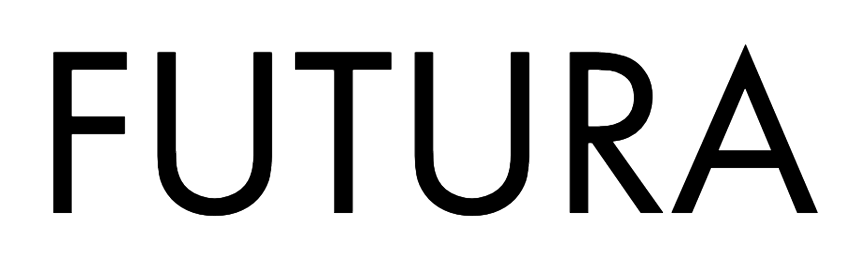
Futura is a sans serif font, created by the German designer Paul Renner in the 1920’s. It’s based on geometric shapes; look at the circle dot on top of the eye, the tall ascenders and matching long rectangular descenders that form the letters below.
SEPTEMBER
Since I started this newsletter fun things have happened to my little Lyons Creative world. I’ve been asked to appear on podcasts, present webinars… has it made me rich? No (not YET, ahem…) but you never know who’s looking or who your newsletter will get passed on to.
Plus, I love doing this and sharing my font finds, and yours. Speaking of which, throughout this edition I’ll share the finds from people who’ve replied to me. So, keep ‘em coming!
Speaking of speaking… clients ask for “pull quotes” to highlight testimonials and particularly juicy bits of interviews. I know it might sound random (I’m not a saddo, I promise) but I have a favourite font for creating speech marks. It’s Abril Display Black.

OCTOBER
There’s a lot going on in the world right now. My friends, sometimes we have to try and distract ourselves from the sad things that are going on. Remember to take time out for you. Hopefully, this newsletter will give you a little “me time” for the next few minutes.
While researching a seasonal font (yup, you guessed it…Halloween) for a new project, I came across this playful font. Kablammo (yes, that’s the font name!):

Created within the Vectro Type Foundry, Kablammo is described as the dancing font from outer space. It was inspired by toys and cartoons of the 80s and 90s plus the Memphis design movement.
You could ramp up the colours and present it in a fun way. I reckon you could even use it as a less spooky but still fun Halloweeny font (in case you get a last-minute design request!). Read more about its creation here. Ready to buy? No need, as it’s free – download from Google fonts. Groove is in the heart!
Bonus - check out the fun emojis within the font set, they made me smile.

NOVEMBER
I went to Mexico, to the Yucatan region – absolutely stunning. When I got home a friend asked if I was okay and if I’d had a good holiday. I said “I miss the colours!” Everywhere you looked there was colour even down to gravesides. Out of respect I didn’t photograph those, but I took pics of graphics and wall art. I’ll put those on my Instagram page.
I noticed there were hardly any printed posters, with a lot of adverts painted by hand. I thought maybe I could stay in Mexico painting signs for a living… I can dream. For now, back to the computer. If you’re feeling inspired to create your own signs, take a look at the selection of brush script fonts. The one I like the look of is:

They say: “A versatile textured font hand-made with black ink and brush. The combination of heavy black ink and a well-used sable brush resulted in this versatile type, readable in sizes large and small, yet with a distinctly hand-made and textured feel. Great for posters, headers, titles and more.”
As it says on the tin, “brush script” fonts mimic the look of a paintbrush. There are so many brush script fonts on the Creative Market website. Take a gander, I’m sure they’ll have Black Friday Deals.
As you can see from the example above, if you mix and match the font colours you’ll have your own wall art poster in no time. And if you hear of any job openings in Mexico, let me know. ;-)
DECEMBER
Thanks for reading. That was the round-up of the font of the month. Here is a one-click link to see the full edition plus more fonts, design and tips on freelancing. I have collated all the past newsletters here for you to peruse… such a great word. Start at Volume No 6 for the January 2023 edition and take it from there!
Follow the ‘Font Love Friday and other Designery Things’ hashtag on socials #FontLoveFriday
Sign up to get the newsletter into your inbox every last Friday of the month. it would be really nice to have you. Also let me know what you think or if you have spotted a fab font in the wild.
Hi! Thanks for reading!
I’m Angela Lyons and I am the founder and graphic designer at Lyons Creative.
I specialise in both print and digital design, I aim to help businesses enhance their visual appeal by creating compelling and distinct designs. I also help freelancers and share my experiences of freelance life.
If you are interested in learning more about my services and how I can assist your business, please feel free to contact me via direct message, and we can discuss your design needs further.