What is Editorial Design?
Simply put editorial design is like a big, colourful puzzle 🧩 where you mix and match different pieces—like words, pictures, and cool fonts—to create amazing print and digital publications.
Ok, a more in-depth explanation now.
Editorial design is a specialised field of graphic design that focuses on the layout, typography, and imagery of printed and digital publications. It involves crafting the overall look and feel of a publication, including everything from the cover design to the layout of individual pages and the typography used for headlines and body text.
Keeping the reader engaged is what I really like about editorial design. It is all about creating pages that are varied and interesting - keep the reader with you. when I say pages - this could include anything from magazines and newspapers to books, brochures, and even websites.
Editorial designers have an understanding of typography, colour theory, and layout principles. Grids, grids - but you can go off the grid… introduce white space. This can balance the layout of text and visual elements - I do this by introducing photography, illustrations, pull quotes and infographics. If it is a visually pleasing design that draws readers in and keeps them engaged and the copy is top notch - you are onto a winner.
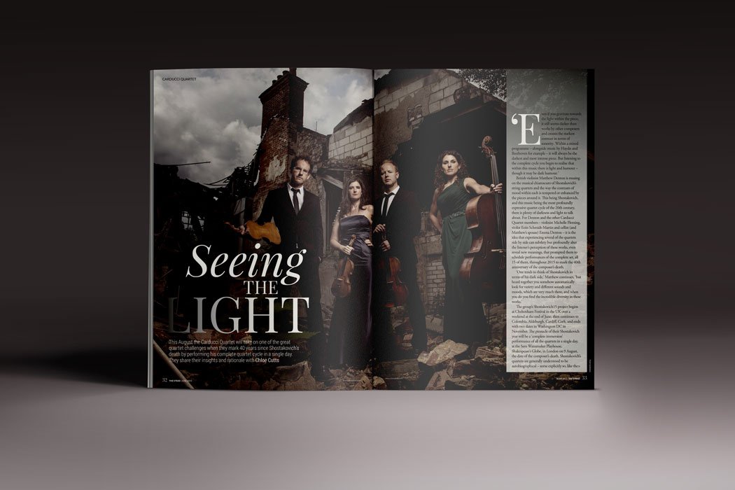
A few magazines I have had the pleasure to design.
What makes a good design stand out?
One of the key elements of editorial design is the use of hierarchy. This involves using typography and layout to emphasize certain pieces of information over others, guiding the reader's eye and making it easy to navigate the publication. By using different font sizes, weights, and styles, as well as carefully considering the placement of text and images, editorial designers can create a sense of order and structure that enhances the readability of the publication.
Another important aspect of editorial design is the use of imagery. Whether it's photographs, illustrations, or infographics, visuals can help to break up large blocks of text and add interest to a publication. They can also be used to reinforce the message or theme of the publication, creating a cohesive design that ties everything together.
I have love working with fonts. Look how they can interact with the image and subject matter.
Who said magazines and print are dead?
If you have followed me - you know I love magazines. When I first started my design career I always wanted to work on a newsstand title. I did eventually... I thought I had arrived! But I moved into B2B titles and in-house publications, where companies got their message across to staff or their clients.
Great editorial design can make any article or message pop, leaving a lasting impression on the reader. So it did not matter if it was a newsstand title or a one-off zine I was working on.
It's all about making sure the reader has an engaging and easy time going through the story while being wowed by the copy and the look and feel of the pages.
If you would like to see the publications I have worked on click here.
Hi! Thanks for reading! Do you have any magazines you love?
My name is Angela Lyons and I am the founder and graphic designer at Lyons Creative. I specialise in both print and digital design, I aim to help businesses enhance their visual appeal by creating compelling and distinct designs.
If you are interested in learning more about my services and how I can assist your business, please feel free to contact me via direct message, and we can discuss your design needs further. Hit the button below!


