Avoiding ‘Death by PowerPoint’.

Presentations can be anything but boring – Tips for lively slide decks
Introduction
Have you heard of this term? Death by PowerPoint'. It is a thing? We have all sat there watching a presentation and hoping that the graphics will keep us engaged whilst we listen to the presenter’s voice.
The whizzing transitions. The clip art images.
PowerPoint has moved on and now there are more online tools to consider to make your presentations stand out and move beyond the overstuffed PowerPoint presentations.
Transform dull slides into engaging presentations.
Ever endured a presentation that felt like an eternal trudge through endless bullet points and lacklustre bar charts?
Fancy swapping out those mind-numbing lists for vibrant infographics that do more than just share data.
Let’s take it back to your company’s brand. Use your brand colours. Use images that complement your tone of voice. Try to resist adding the incorrect whimsical fonts or graphics that are animated.
Online software tools such as Adobe Express, Canva, Keynote, Pressie or Google Slides are other tools to create your presentations.
Adobe Express has a free design background for your presentation slides. The designs are varied - so if you have a contemporary or corporate brand you have the option to start here. Take a look the the free editable backgrounds and work on personalising it for you and your business.
Another online software tool is Canva. It has graphic elements that are ready to use and make your presentation stand out. But don’t go down the rabbit hole of over-complicating your slides.
TOP TIP: Use your brand document to create a template that you can share around your organisation.
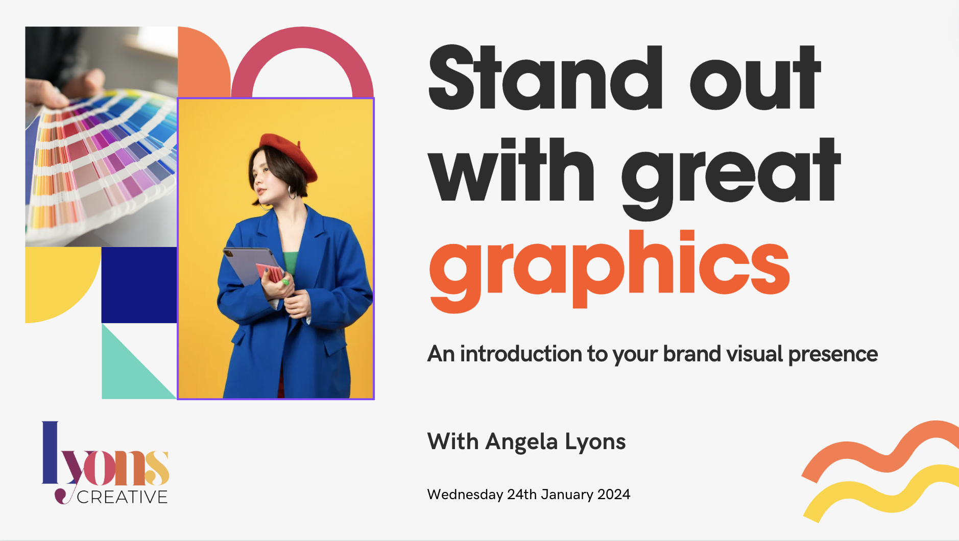
My opening slide to my webinar. Using my brand colours. Created using Canva.
Avoiding ‘Death by PowerPoint’ with creative graphics and words.
Have you ever considered using icons or illustrations that vibe perfectly with what you're talking about? It's easy to fall prey to cramming too much text onto slides – sometimes a punchy one-liner packs more punch than rambling paragraphs.
How about keeping your reader engaged by storytelling? Tell a tale throughout your presentation; it helps everyone keep up and remember stuff way better. You can also introduce creative graphics here. Keep it simple.
Get this right, people will walk out remembering what you said because they didn’t just hear info—they lived through the experience with you. Take a moment - what was the last presentation you went to? Did something stay in your mind and why? Creating lasting impressions is one of the goals when you stand up there in front of them all.
TOP TIP: Remember to use pictures as signposts highlighting important bits rather than just frilly extras - you want it to be an engaging experience.

Think about using the minimum amount of words
Overused graphics to try and avoid.
Oh my! I have to image search quite a bit for my client’s presentations. Please try and avoid the below as they are ‘cheesy’ and overused. We have:
stepping stones
stacked pebbles
jigsaw puzzles
cogs turning
the good old handshake
not forgetting the thumbs-up
You get the picture.
TOP TIP: Look at your slides. Have you used imagery that does not add much context to your words?
Wrapping it up.
Fancy escaping from that dull 'Death by PowerPoint' routine?
Think about what is on your screen and how you want to say it.
TOP TIPS:
Create slides that are consistent with the company brand
Use simple imagery - that tie in with the company’s tone of voice
If possible - use storytelling to keep the reader engaged
I joined an online community on public speaking called The Keynote Club. It’s free to join and you can practice your public speaking. Everyone is friendly and cheers encourage everyone on. Some of the best talks are ones with fewer slides as you focus on the speaker not so much the images on screen. So think about it. Often less is more as you don’t want to bore! Check them out.
I recently presented a webinar for Link Up London on brand guidelines. You can take a look at my slides and the presentation here.

If you would like me to speak at your event or podcast - see what I have done in ‘Press and Chats”.
Hi I’m Ange.
If you need to work with a graphic designer to help get your presentation looking professional - let’s talk!
Book a call with me - hit the Button below. 👇